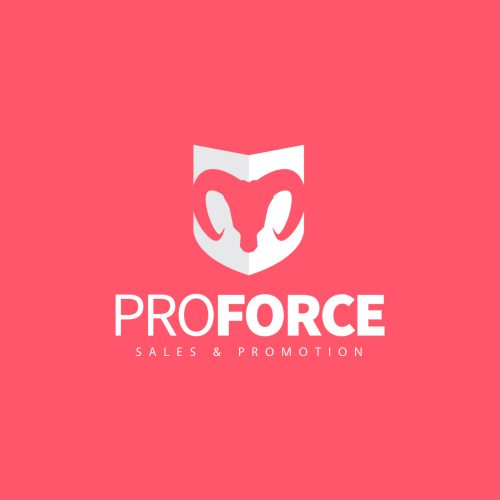
Objective:
Creating a strong, bold logo in combination with an informative website.
Description:
In 2017 the company Proforce Sales and Promotion opened its doors. The focus of the company is door to door sales. For the client it was important that the image of a ram was processed in the logo. In combination with the city where the company is based we created a powerful icon that will represent the company's image. After the logo the website and business card were realized. The main focus of the website was to make it as easy as possible for new recruits to apply.
Logo • Website • Business card
Objective:
The main objective was to convert the client's photo into a strong, bold logo that will represent him as a person and his product.
Description:
In late 2020 Muscle Machine Nutrition was founded and I was fortunate to design the logo. The name says it all, it's about supplements to get your muscles growing and get strong as a machine, obviously. The client send me his photo with the request to convert that photo in to a recognizable illustration. In addition, the client had to look half man, half machine. It was something challenging I did not do before.
Logo • Social content
Objective:
Providing communication guidance and copywriting services, Het Publikesbureau requested a logo & business card to represent their company and services.
Description:
At the end of 2017, I started working on the logo for Het Publieksbureau. The company specializes in communication and copywriting. That's why the request from the client was to implement the idea of punctuation marks into the logo. In combination with the letters P&B we created a simple but powerful logo that covered all of the client's wishes.
Logo
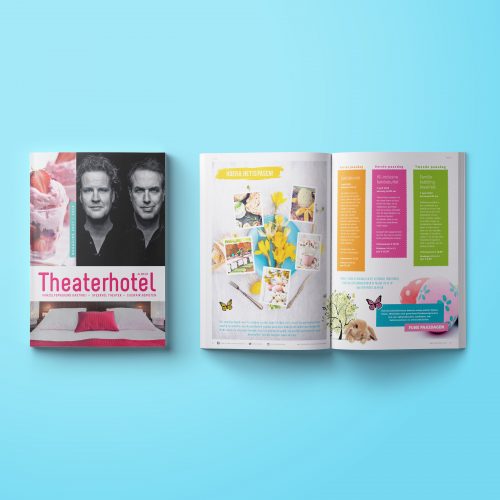
Objective:
After my first two years as a graphic designer at Heutink I was ready for a new challenge. At Theater Hotel Almelo (THA) I had the chance to further develop myself working and combining multiple corporate identities.
Description:
THA consists of a hotel, a theater, and 4 different restaurants. Every division had its own identity, its own branding, and different target audiences. For me, this was a great next step to enhance myself as a junior graphic designer. The best part was that I could create so many different products in total different styles so the work never got old.
Corporate identity • Menus • Magazines • Brochures • Vouchers • Flyers • Posters
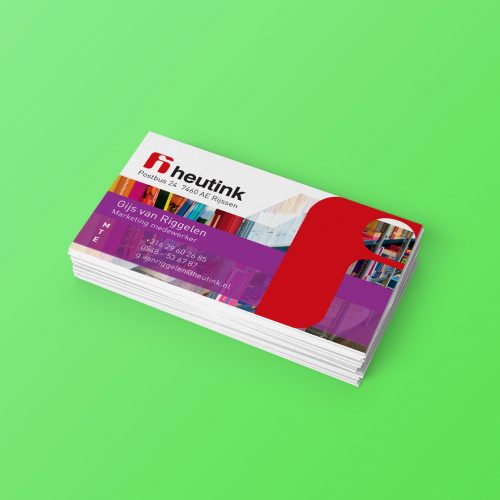
Objective:
In 2013 I officially started working as a junior graphic designer at the Heutink Marketing department. My main goal was to get a taste of what it's like to work in a marketing team, and how to implement an existing corporate identity and make it my own.
Description:
Heutink specializes in creating all kinds of materials and products for the purpose of education (schools). Also people who love crafts were a big sales market. For me it was a perfect environment to develop myself as a full-time all-round graphic designer and to get a taste of the corporate spirit. I had the opportunity to work on a wide range of products. A great first step for my following career. Assisting in the creation (functionality, determining the look and feel) of educational games was the cherry on top for me.
Corporate identity • Product design • Product packaging • Posters • Flyers • Business cards
Objective:
For the launch of a new cosmetics brand Nasentia (previously Naroma), I was asked to design the logo & corporate Identity that would represent the nature aspect of the product (natural cosmetics) and would address the target audience.
Description:
The client had no previous experience with creating a brand identity. That's why they asked me to be responsible for the whole visualization of the Nasentia brand and its product. During this creative process, I had all the freedom to play around with different styles and ideas. The final design was a success and to spread the word we followed up by creating social content and promotional flyers. This still is one of the projects that I enjoy working on the most.
Logo • Corporate identity • Product packaging • Social content • Flyers
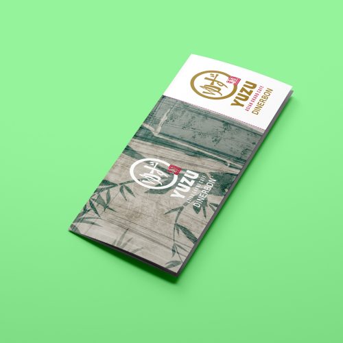
Objective:
After the corporate identity was finished, I had the pleasure to create the first printed materials for the restaurant, perfectly in line with the new Yuzu branding.
Description:
After a constructive session with the client, we painted a picture of the wishes and demands for the new restaurant menu's look and feel, flawlessly in line with the new logo and stylesheet. To spread the word, we designed a flyer to promote the new restaurant in the area. the next and final step of the start-up process was to create a restaurant voucher as a cool give-away and to promote the venue even more.
Logo • Gift card • Flyer
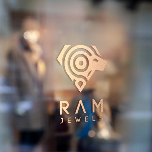
Objective:
It was the client's request to design a logo that would represent her zodiac sign (ram) and a jewel, in this case, a diamond.
Description:
RAM Jewels is specialized in creating handcrafted and custom-made jewelry. Therefore I created an icon that represents her product but also represents the client itself. The ram in the middle of the logo stands for the creator and the diamond shape represents the product. The logo is gracious but at the same time strong and powerful.
Logo
Objective:
The moment I started working for Guide-ID, the new branding was still under construction. The new identity was created by an external design agency. It was my job to implement this new style in every existing and new design in the best ways possible.
Description:
I started working for Guide-ID in 2019 as a freelance graphic designer. In a year I was hired as a full-time employee and from that point the real adventure began. In the following years it was my goal to bring Guide-ID's designs to the next level with matching illustrations and animated ads.
Logo • Corporate Identity • App Content • Animations • Google Ads • Product packaging • Webdesign
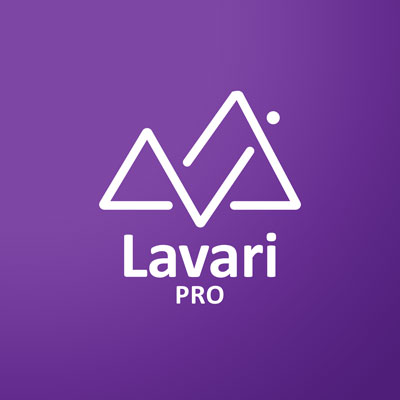
Objective:
Design a modern logo including the letters "LAVARI" and a landscape.
Description:
Lavari Pro is a one-man company active as a freelance video- and photographer. It was the clients' wish, to design a logo and a business card to represent his company and his services. After presenting multiple concepts, we decided to process the letters of the company name, combined with a landscape, in the logo's icon. During the design process, the client was continuously involved.
Logo • Business card
Objective:
A simplistic, modern logo with a humoristic twist, that represents the club and its members.
Description:
Tobkoks is a group of men who have a passion fo culinary enjoyment, and don't take themselves too seriously. Since it's a men-only club, I wanted to express that key feature in the logo, in combination with a culinary element. The somewhat exuberant, chic mustache, in combination with the chefs hat, is the final result.
Logo
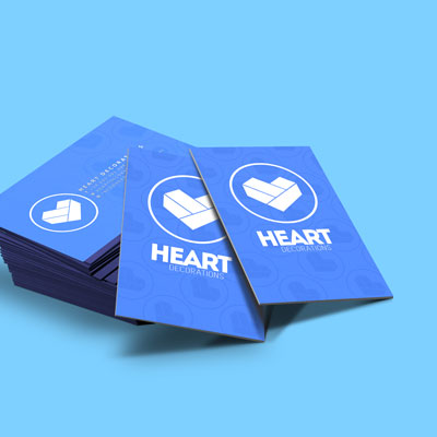
Objective:
A modern, minimalistic logo, including an icon what represents the block shapes they use in their product design.
Description:
Early 2017, Heart Decorations started making hand-crafted wooden furniture. All products are constructed from big wooden blocks. This is also the most recognizable feature. To promote their work, Heart Decorations was in need of a modern logo that covered the unique product shapes combined with the love and care the crafters put into their work. Hence the name.
Logo • Website
Objective:
A simplistic, modern logo that represents the core values of the company.
Description:
WondUniek is a select group of medical professionals who are specialized in all types of wound care and recovery. The challenge was to implement the diversity of people (colors) combined with soft, round shapes to represent the care and personal aspect of the company.
Logo • Website
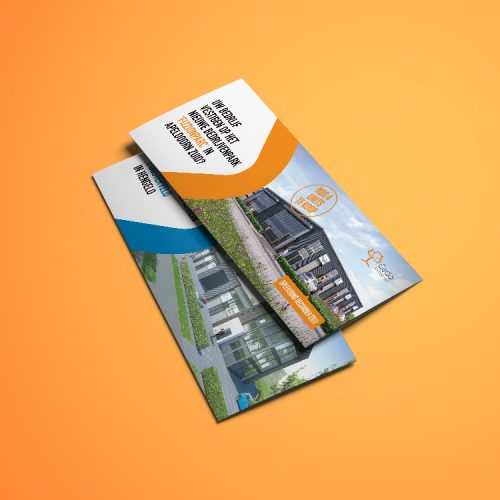
Objective:
Design two different flyers for two completely different projects. Each flyer with its own style but still within the boundaries of the corporate identity.
Description:
Janssen de Jong is an innovative company specialized in project development and housing. For a development project that took place at two different locations, we were asked to design two different flyers. Both flyers had to be in line with the corporate identity but also had to be different from each other. Of course the promoted project had to look appealing as possible for the target audience.
Flyers
Contact me
I see you are interested. I understand that this is just a glimpse of who I am and what I do. For more information dont hesitate to contact me through one of the options below. I never say no to new adventures.
gvriggelen@gmail.com
Objective:
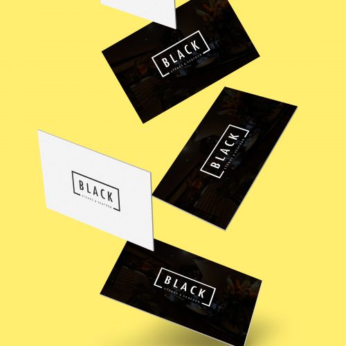
Working for the Restaurant Group Amsterdam I design all kinds of online and offline (marketing)materials. I provide my services since 2014, and till this day they are still one of my biggest clients as a freelance designer.
Discription:
Restaurant Group Amsterdam consists of 4 restaurants (Restaurant Balck and Blue, Restaurant Black, Bistro Bleu, and Restaurant Red) located in the center of Amsterdam, and is still one of my most prominent clients as a freelance designer.
Every restaurant that is part of the group has its own style and branding. For each restaurant, I had the opportunity to create the branding from scratch. I was free in the creative process, the only request from the client was that the identities had to be modern, sturdy, and simplistic. Even though every restaurant has its own look and feel, I also implemented similarities in their corporate identities.
Logos • Corporate identities • Menus • Banners • Gift cards • Flyers
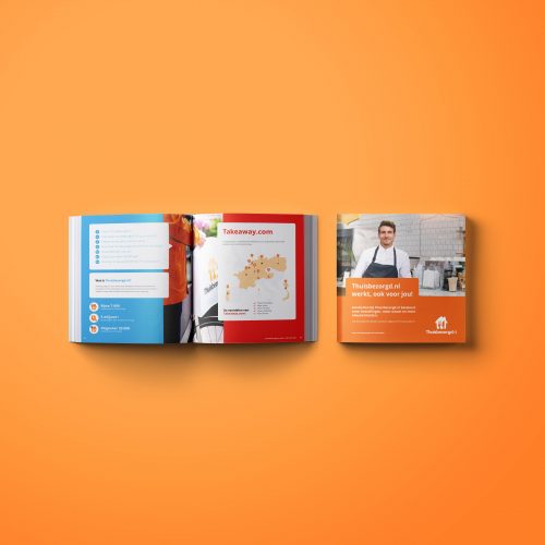
Objective:
As a graphic designer working for Bureau Hardt (branding agency) I had the privilege to work on some materials for the largest and most well-known food delivery service in the Netherlands.
Description:
In collaboration with creative mined colleagues, we created multiple brochures to promote the company and its service and to inform the target audience about the possibilities Thuisbezorgd.nl had to offer. The printed brochures were multi-language and used in different parts of Europe. This was my first time having a multinational company as a client. Implementing the corporate identity the correct way had the main focus.
Sales- & product brochures
Objective:
As an established restaurant Dock19 was ready for a new direction. In 2014 the owners requested to restyle their branding and to give the restaurant a whole new image.
Description:
Dock19 Steaks & More is a restaurant that is part of Theater Hotel Almelo. To improve their image the restaurant interior, as well as the menu, got a make-over. In addition, we also had to update the corporate identity. The goal was to represent the restaurant as a unique venue, where you can go out for cocktails but also enjoy a proper steak before hitting the lounge bar. For the owners, it was important that the logo had a woman's touch.
Logo • Corporate identity • Menus • Flyers • Posters • Advertisments
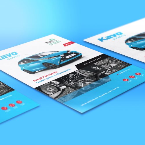
Objective:
Creating the global corporate identity of the company and expanding their new look and feel to its full potential to improve the company's image.
Description:
Kavo Parts is an international company that specializes in manufacturing car parts. As a full-time graphic designer at bureau Hardt, I had the privilege to create and develop a completely new corporate identity for Kavo Parts. Through the seamless implementation of the new branding on product packages and other promotional material it was my responsibility to create and improve the company's global identity.